Monday, June 15, 2015

Progress with the coding of Question and Answer Page of AskFedora

10:11 AM Posted by Unknown 2 comments
In the past week I started working on the Question and Answer page of AskFedora according to my mockups. I followed a mobile first approach in coding the web page and you can view it here at my Openshift instance - http://askfedoratest-anuradhaw.rhcloud.com/

I further have got to do the following tasks regarding the Answer page:

1. Coding the desktop hamburger menu.
2. I have discovered a bug in the current interface I have created for the Answer page. That is in the mobile view after I click on view comments and then again on hide comments and expand the screen of the browser then the comments that should appear in the desktop view do not appear. I have used the following code of javascript to view/hide comments:

$('#comment-text-1').click(function() {
                   jQuery(this).text('view comments');
                if($('#collapsible-comment-1').is(':visible')){
                      jQuery(this).text('view comments');
                }else{
                      jQuery(this).text('hide comments');
                }
                $('#collapsible-comment-1').slideToggle("fast");
                return false;
});

3. Code the elements that appear when I click the "add comment" option.
4. Put two up and down arrow icons to click for up voting and down voting of questions.

And also I faced some cross browser compatibility issues such as the Sass mixin I used for vertical alignment of content seems not to work correctly in Firefox and Internet Explorer browsers. The Sass mixin I used is:

@include vertical-align()

which is:

-webkit-tansform: translate Y(-50%);
-ms-transform: translate Y(-50%);
transform: translate Y(-50%);

And also there are issues in responsiveness when it comes to web browsers such as Internet Explorer. I am going to look into these matters and discuss with the mentors on how to deal with such issues.

And for the ASK button I used a lesser green color which is: #42a500, and for its border I used a darker green color which is: #128c1e, because the color I used in my mockups did not went well with Fedora blue. 

And further your views on this are welcome as this is a UX based project and all the design work I do depends on user feedback.

I have also developed a sliding menu in the mobile view of the web page which is built using Sidr which is a jQuery plugin to create side menus and making it responsive. 


Sunday, June 7, 2015

Minutes of the Skype call #2 - Reviews on my first page layout

10:07 AM Posted by Unknown No comments
Today also we had a Skype screen sharing session with my mentor Sarup that gave me a lot of insight into building up good layouts for web pages. I have created a web layout by using differently colored boxes so that I get a general idea of how the layout of the web page should be. I have set up an Openshift instance for the code that is in progress which is http://askfedoratest-anuradhaw.rhcloud.com, where I have committed my changes on the web layout.

Earlier I thought that having 5 breakpoints according to the way that Bootstrap uses might give us more flexibility in designing. Yet I was mistaken and I was told that the breakpoints should be decided based on the content and some of the pages that we are going to design might even be created by using less than 3 breakpoints. 

Sarup via screen sharing showed me how the layout of a webpage can be designed based on the content so that it can even fit for an iwatch which is about half the screen size of 320px. He told me that without getting our web layout to strictly follow a fixed set of breakpoints we can always have the flexibility to decide where it should break depending on the content.

The following are screenshots of the web layout I created and I would like to include them here as well and point out the mistakes that I was shown and instructed to correct during the skype call.

Below 480px (Mobile view of the Answer page)


Here I have created the pop up menu that pops up when the hamburger icon is clicked, to fade in and out using the following javascript code:

function toggleMenu() {
   $("#pop-up-menu").fadeToggle();
}

Yet I was advised to code that so that it slides from left to right. I was given a resourceful link to refer to which is: https://medium.com/@sureshvselvaraj/animation-principles-in-ui-design-understanding-easing-bea05243fe3. This is an article which talks about animation principles like sliding and how to make it accelerate during sliding rather than making it slide at constant velocity which is quite boring specially when it comes to mobile devices. I was asked to refer that and in case I get a difficulty to code it from scratch I was advised to use SIDR, which is a jquery plugin to create side menus.

Below 768px (Tablet view of the Answer page)


This is a screenshot I have taken just at the transition at 480px. I was pointed out that my layout is broken here because as you can see the yellow colored section becomes too thin and it might not be able to hold the content fully. This is a disadvantage when we try to use fixed breakpoints and I was advised to decide a breakpoint so that such kind of a thing would not happen and the yellow colored area with the text left on it has sufficient width to hold the content.
  
Above 768px (Desktop view of the Answer page)

Here the mistake was I had too much space between the Hamburger icon and the Search text box. I was told to try experiment with a lesser space between these two. 

And at the same time the width of the ASK button also was quite large and I was advised to reduce the size of the ASK button when it comes to the desktop view.

Apart from these I was given further articles to look at which comes handy in working with breakpoints. Those articles were:
If anyone is interested to learn more about responsive web design and designing layouts based on breakpoints those articles would be very useful and you can refer them to get better in handling breakpoints. And during the next week I will be working more on getting the layout correct and move into detailed coding of the Question and Answer page of AskFedora.

Tuesday, June 2, 2015

Minutes of the Skype call

6:57 PM Posted by Unknown No comments
Me and my mentors Sarup and Suchakra had a Skype conversation on 31st of June 2015 where they reviewed the mockups that I have already created using Inkscape. We had a screen sharing session and they pointed me out some of the modifications that I need to do and some of the points that I need to keep in mind when coding the mockups.

They went through my mockups one by one and gave me feedback on what I have done. I will also include them here in point form under each mockup we went through during the call.

The Answer Page Desktop View
  • We agreed to change the layout of the Answer Page a bit by letting the hamburger menu out to the left and let the search bar occupy all the space like in the design provided by my mentor Sarup - http://paste.opensuse.org/44501225.
  • And they noticed a problem with aligning of text in the second div of the aside to the right. I was told to align text in that also to the left because aligning it to the center causes inconsistency in the webpage.
  • And also in the question and answer area the boxes with username and information regarding karma etc. were identified to be inline with the tags.
The Answer Page Mobile View
  • When it comes to the mobile view, because of the comments that occupy a lot of space in the screen it gets a bit cluttered. And hence we agreed not to show the comments when it comes to the mobile view. If the user wants to see the comments he or she may need to click on the "Comments" text to get them visible on screen.
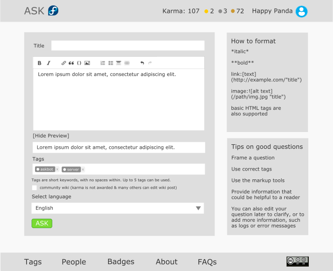
The Ask Question Page
  • Here another inconsistency was identified that the text box in front of "Title" text should come to the bottom preserving consistency. It was also discusses that it is good always to keep the text boxes under its corresponding label because it reduces the eye movement of the user entering details to the textboxes.
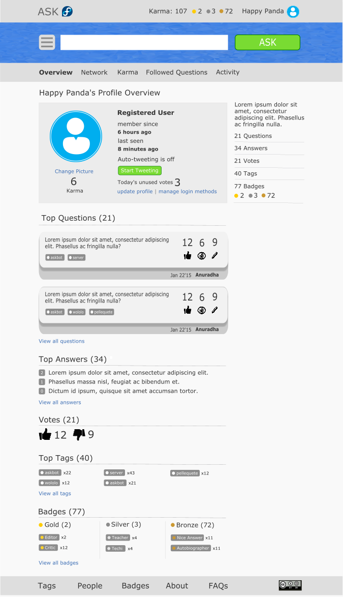
 The User Profile Page
  • The number of up votes and down votes section was agreed to move to the side of the number of karma which is in the section containing user profile information. That way the space taken up by the number of votes is reduced.
  • Also from the aside we decided to remove the statistics on votes and have accordions that slide down to show the top tags and top badges when the user clicks on the "Tags" and "Badges" text. Also I was advised to include up and down arrows in front of the text so that the user will fell that those can be expanded.
  • Also from the section containing profile information we decided to remove "6 hours ago" and "8 minutes ago" text and agreed to make then appear as tool tips when hovering over "member since" and "last seen text".
The Color Palette
  • I was told to use somewhat lesser green for the ASK button when I am coding because the green that I have taken from the Fedora color palette does not go well with the Fedora blue that I have decided to use in text of links.
In general they advised me to have a good layout first when coding the mockups because a bad layout is hard to fix. So, I was instructed to code the layout in the form of boxes where each box will have a different color. And then only go for the detailed coding inside each box. That way we can create a good layout before we get into details. 

Saturday, May 30, 2015

Updated mockups for Askbot

8:47 AM Posted by Unknown No comments
According to the feedback received from the mentors, I updated the mockups that I have created for Askbot using colors used in the Fedora color palette and also giving more focus on the grid system. I have included some little user experience improvements also in these mockups and we are planning to discuss further on user experience of Askbot as well.

Answer Page Desktop View Mockups


Answer Page Mobile View Mockups


Ask Question page desktop view mockups


Ask Question page mobile view mockups


User Profile page desktop view mockup


User Profile page mobile view mockups


Sign in page Desktop view mockups


Sign in page Mobile view mockups


Tags Page Desktop View Mockup


Tags Page Mobile View Mockups


People Page Desktop View Mockups


People Page Mobile View Mockups


Badges Page Desktop View Mockups


Badges Page Mobile View Mockups


Wednesday, May 27, 2015

Labels